I very much doubt that this post will lead me (or you) to any great revelations, nevertheless I have been contemplating book covers lately, trying to determine if there is any trend that I can discern in this second decade of the 21st century. I am sharing with you what I’ve learned, which is: oh my goodness, they’re all over the map!
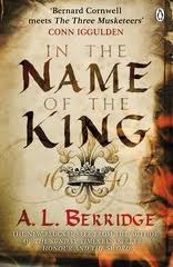
To begin with, let me limit this discussion to historical fiction and U.S. publishers because if I try to compare U.S. covers to U.K. covers things will get far too complicated. (Oh heck, just for fun, let’s take a look at a couple.)
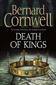
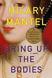
U.S.
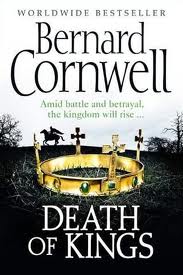
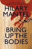
U.K.
Note how dark and light have been reversed in the Cornwell books (and how the dark is much darker in the U.S. version), and how the U.S. version of “Bodies” focuses on the character of Ann Boleyn while the U.K. version is conceptualizing a metaphor. Fascinating!
Now, down to business. From my admittedly biased point of view, based on a very small sample, I would say that book covers might be trending towards a more spare look. For example…
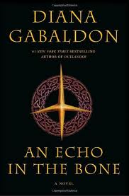
 … compare Diana Gabaldon’s first book with the most recent offering in the Outlander Series.
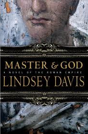
 Or compare Lindsey Davis’s 1997 “The Course of Honour” with her soon to be released title “Master and God”. Much less going on in the more recent covers, don’t you think?
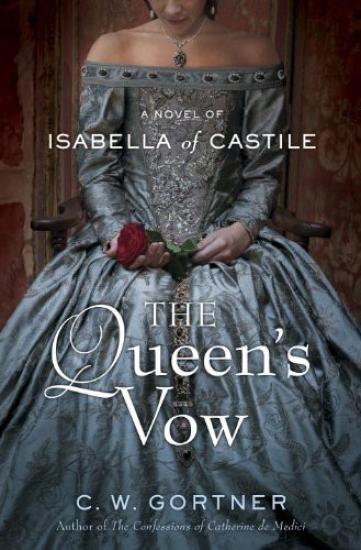
Another thing I see is a move away from the literal towards imagery that captures an idea or evokes a mood. And this is true across all genres, I think. Take a look at one of the “Twilight” covers for a brilliant example of this. The “Twilight” covers are stunning. Yes, historical novels still have the tried and true: Tudor women in their gorgeous gowns with no heads…
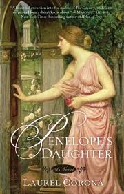
the book covers drawn from classical art…
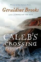
…covers with evocative landscapes…
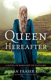
or those with figures who face away from the reader.
If historical fiction covers tend to be more traditional-looking and far less edgy than other genres, perhaps it is because it is extremely difficult to look backwards and forwards at the same time. But I also think that historical novels may be trending just slightly more towards the spare than they have in the past, and away from the literal to evoke a mood or an idea. What do you think?
Great thoughts! That cover for "Queen Hereafter" looks a lot like the first try for your "Shadow on the Crown" – at least the pose, hair, and gown!
Most of us don't have an enormous amount to say about our covers. I was pleased to have my editor ask me yesterday for a description of Charles II and ideas about what he and Nell Gwynn might wear for the mass market paperback cover of "The Darling Strumpet." I sent her some – including Johnny Depp as Rochester in "The Libertine" — I'd buy a book with that on the cover!
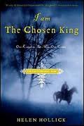
I love "The Chosen King" cover – hoped to have somethink like that – horse with riders, sense of danger – for "September Queen" but no luck!
Waiting with crossed fingers to see what they come up with for Bess of Hardwick!
Interesting article – thank you for sharing (and thank you for including my 'I am the Chosen King'!) I like the colours in the US version of mine, but I personally prefer the UK cover of the book (titled 'Harold the King' in the UK)I think I prefer Hilary Mantel's UK cover as well – Bernard's – the US one.
Hi Patricia:
Enjoyed your look at various covers and the simplification of design. As an historical fiction author myself, it made me wonder how my book cover would stand out amongst all the competition–or whether I’ll be looking at a redesign when the book goes to another publisher. Love your site–good work!
Thank you Joanne. I apologize for not putting your comment up sooner. I’m still learning how this new website functions! Best of luck with your book and with its cover!